A new book explores the meaning behind typographic ornaments and marginalia, uncovering the whole history of Western Europe within these elaborate symbols. Contributing editor Guy Lochhead delves between the sheets.
The Little Book of Typographic Ornament, David Jury
Before the invention of woodblock printing in China or moveable type in a printing press in Europe, all documents were written by hand. This was time-consuming and difficult, but full of opportunity for the scribe to demonstrate their artistry. It was not uncommon for manuscripts to be “illuminated” with rich illustrations of gold and silver, aggrandising opening letters and busying the blank space of the page with “marginalia” and “drolleries”.
The invention of printing made the reproduction of text far more efficient. Now letters could be set and re-set into blocks of text stamped onto paper, running off multiple copies with relative ease. Johannes Gutenberg was one of the first to capitalise on this new industry, adapting a wine press in Germany in 1450 to mass-produce bibles that the lay-person might afford. The text was strictly bounded by white space into ordered columns. Marginalia and illuminations were later added by hand.
Just 20 years after Gutenberg, though, printers began incorporating hand-carved woodblocks to create decorative borders. Ornamentation had arrived in print. “Flowers” were developed from the brass stamps bookbinders impressed upon their leather covers for centuries and placed purposefully to break up the page.
At the advent of letterpress printing in Paris, Pierre-Simon Fournier began embellishing these flowers in an ornate style that would sweep Western Europe through the 18th century. He created catalogues of the ornaments without any guidance as to their usage or meaning.
More inventive compositors began arranging the flowers together to form intricate borders and illustrations and soon type foundries employed artists to do this more beautifully. Type designers included ornaments in their collections, seeing them as an essential complement to the text, providing an expression free from the tyranny of the alphabet.
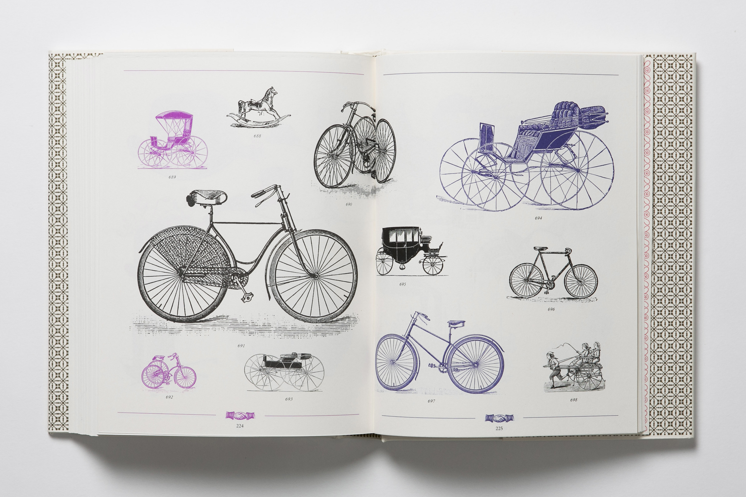
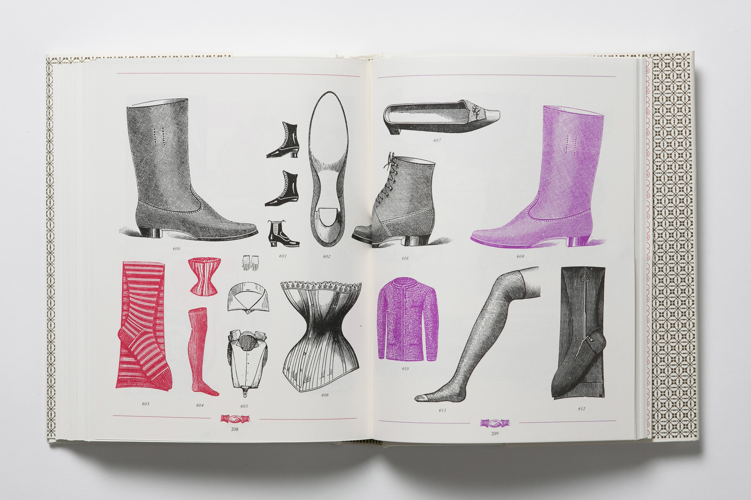
The Industrial Revolution saw developments in technology that allowed for ever more detailed and elaborate flowers. Less symbolic and more pictorial, “stock blocks” could be produced showing commonly-used images. When “photo-engraving” was developed in the mid-19th century, meaning an image could now be printed with photographic detail, the typographic ornament was all but redundant as an economic form of illustration.
Around the same time, though, William Morris and friends were rediscovering the flowers’ true, original purpose as objects of pure and almost-functionless beauty. At the Kelmscott Press, they hand-crafted their ornaments, winding them through meticulous organic typefaces. The influence of this spread through many small presses (Pelican, Nonesuch, Curwen) up until the First World War.
The horror of the Great War blew apart the idea of man at peace with nature, and aesthetics such as Kelmscott’s were seen as vapid and false. Designers at the Bauhaus in Germany stripped the ornamentation from these ornaments to find the foundational components of their design. From these simple elements perhaps a new future could be built. Albert Schiller arranged punctuation into pictures, creating a deliberately - politically - transparent ornamentation of utility, reproducibility and new truth from old material.
Perhaps it is surprising to read so much from marginalia, but written in these symbols we find a whole history of Western Europe - Arabesque flourishes celebrating the Islamic scholars who saved Classical literature from the fires of Alexandria; Rococo opulence spilling out of France’s Revolution; Neo-Roman stateliness after the excavations at Pompeii; Japanesque minimalism marking the year Japan opened its ports; Bauhaus reductionism mourning all that fell in the Great War...
Early printing manuals gathered examples of these flowers, but their origins were never given. A new collection, The Little Book of Typographic Ornament by David Jury, aims to pay historical credit to those artists and industrialists who set the foundations of what we now know as “graphic design” (a term coined, of course, by a typographer, W.A. Dwiggins) – that all-pervasive mix of art and industry that has become our cultural currency.
Most influential of all these designers, perhaps, were those at the Bauhaus. Their aesthetics of affordable, reproducible, tidy functionality may be seen in most modern design. Apple’s Steve Jobs and Jonathan Ives repeatedly reference the Bauhaus in their products, and Jobs’ pioneering decision to include a range of digital typefaces in the first Apple Macintosh computers may be seen as a direct continuation of their principles, bringing the tools of typography into the hands of the home-user.
In recognition of this, Jury equips us with digital copies of all the ornaments featured in the book. Like a modern-day Fournier catalogue, they are presented with no rules for usage, free for us to misuse with all the creativity of those early compositors.


