Meet the maker: Ruth Thorp

For issue 10 of Ernest Journal, we asked Ruth Thorp to illustrate our ‘Milk of Deer’ feature by Nick Hunt, which explores the reintroduction of reindeer to the Scottish Highlands. Ruth invites us into her Bath home and studio to tell us how lockdown has affected her creativity, and to share some insights for optimising her work and home space

1_Ruth Thorp_Ernest Journal Interview Images.jpg

Illustrated by Ruth Thorp

Ruth, you created these gorgeous illustrations for our 'Milk of Deer' feature in issue 10. Take us through your process.

I approach editorial commissions in much the same way I do my personal illustration collections, although of course the biggest difference is having a specific brief and piece of text to respond to. I don’t like to get too bogged down in details when responding to written work – find this can limit my creativity. I often find I have an immediate visual response for the feel and tone after the first reading, and I like to capture this before setting out the specifics. As this article featured the Cairngorms, a place I’ve not visited, I collated some visual research of the area to refer back to.

For the majority of my work I start with colour, and this was no exception. The colours of the Cairngorms are pretty spectacular, particularly when you zoom in on the lichen and stone, and the golden autumn hues of the forests, and so I used these grey-blues, golden and fiery oranges to create my colour palette.

I then set about plotting and drawing some basic shapes and composition for each of the three illustrations, which I worked on concurrently throughout the process. Once happy with the basic form, I then turned to pen and paper to draw the tree shapes and foliage. At this stage I’ll fill pages and pages with black pen drawings and then scan these in and convert them into vector objects so I can colour, compose, combine and edit them digitally. My work is always a mixture of these hand-drawn and digital elements. I tend to draw the more natural, free-form elements, such as the trees and foliage, by hand and the more precise work, such as the landforms, boat and animals, digitally.

I also combine these with photographic textures I have taken, such as slate walls or stone paving, which adds depth, variation and interest to the flat-colour work.

How would you describe yourself as an artist?

Ooh this is tricky! I guess I’m a digital illustrator and designer with a love for colour and bold graphics, who is inspired by the natural world, incredible landscapes and a sense of adventure.

8_Ruth Thorp_Ernest Journal Interview Images.jpg

What have been the highlights of your illustrating career so far?

Well actually, being asked to illustrate for Ernest twice has been pretty cool. It’s such an honour to be asked by any publication to produce work for them, and I’ve had a number of front covers, which is particularly exciting and a bit surreal when you see your artwork on display in the magazine racks of shops.

Other highlights include illustrating a number of books, including those written by my dad, which subsequently formed the basis of a collaborative poetry and illustration exhibition shown at Oriel y Parc in St Davids, Pembrokeshire. It was wonderful to work on a much bigger scale for this and design specifically for the beautiful circular tower room with its impressive conical roof. I also recently created album artwork for a wonderful musician called Jenny Biddle. It was really good fun and it still makes me smile to I see my cover art pop up on Spotify!

I think the biggest highlight, though, has been building my own brand and product line, which I sell both online and across the country in over 50 fantastic independent shops and galleries. It’s lovely to know that my work helps support these wonderful businesses and that it is being enjoyed in people’s homes and workplaces, or being shared with friends and family. It’s always such a boost to hear wonderful feedback from happy customers, and I love forming friendships with my stockists who’ve encouraged me and helped my business thrive over the years.

Are there any other exciting projects you're working on?

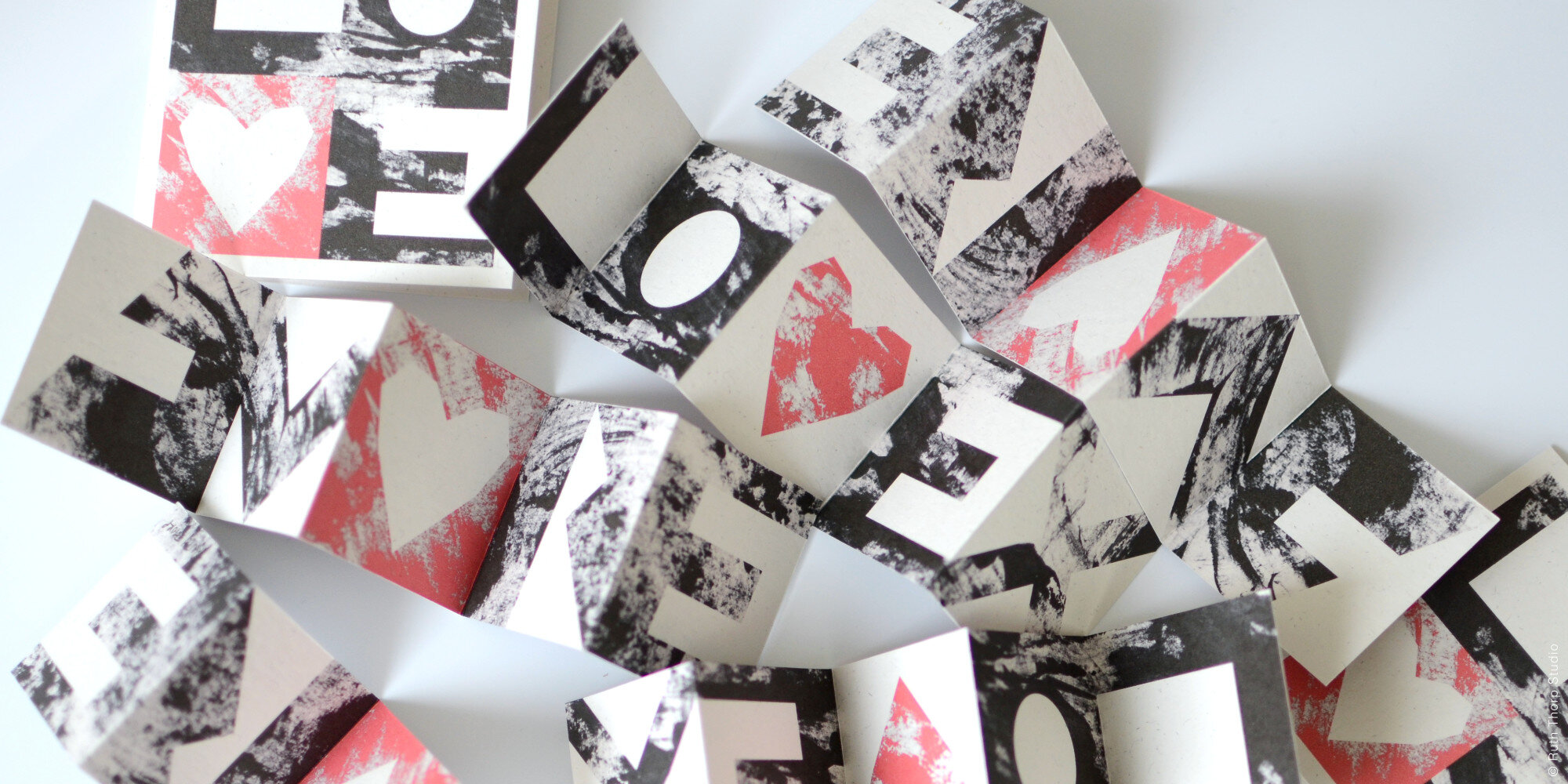
I don’t have a lot of projects on the go currently - lockdown has sapped my creativity and I’ve also been distracted by keeping up with what’s been a really busy online sales period during the pandemic. I do have a few projects in the background that have been sitting idle for a while - including a new book with my dad (sorry Dad, I’ll get there at some point) - and a short illustrated story I’m hoping to make into a zine. I’m hoping I’ll find the energy and inspiration to get back to these really soon as well as create a new collection, which is long overdue. I did create a little folded book last month, which has been really well received, so I might try to do more of those as they’re small and manageable, while I find my creative mojo again!

4_Ruth Thorp_Ernest Journal Interview Images.jpg

Where do you turn for inspiration, particularly when you're in a creative lull?

Normally I would take myself off to the Pembrokeshire coast where my mum and dad live, but obviously that hasn’t been possible recently. Beach walks and spa breaks normally help to get my creative juices flowing and I can’t wait til this is a possibility again. I would say that I’m definitely in need of a break and change of scenery! I’ve experienced a creative lull for the last year and have really only been able to focus on, and complete, much smaller projects. I’ve had a few ideas, but they haven’t really gone anywhere yet so only time will tell as to whether any of these ideas take hold.

I’m always surprised when inspiration strikes though. In the past it has come from specific briefs; pieces of writing and poetry; flicking through coffee table books and watching my niece. Quite a few of my collections have been sparked by a single word or theme given to me by a gallery for an upcoming exhibition. I also get a lot of inspiration from my family – we are all creative and have lots of projects on the go.

What have you taken away from this past year?

I guess, like everyone, it has been a mixed bag of positives and negatives. On the plus side, I’m lucky that business has really flourished since the start of the pandemic, probably largely down to people turning to online shopping, and this has been a massive help in keeping me busy and distracted throughout. Of course, missing family is probably the hardest part and I have struggled at times with my anxiety as well as missing my dancing and exercise classes a lot.

But on the whole, being a natural introvert and a home-bod has meant that the lockdown suits me quite well and hasn’t affected my everyday life all that much. I already worked from home for myself so I think this has been a major factor in being able to cope with that aspect well. We are also very lucky to have a beautiful space to live and work in after completely renovating it over the last few years and which we had nearly finished before the first lockdown: it certainly would have been a different experience had we been in the chaos of the earlier stage of our renovations!

Tell us about your work space - how does it reflect you?

My partner and I have backgrounds in architecture, so interior and product design is a shared passion for both of us. We’ve spent the last three years (on and off) completely redesigning and renovating our Georgian townhouse apartment in the centre of Bath. We both now work for ourselves from home as illustrators and designers so the whole apartment transitions between computer work; messy printmaking space; product making and packing station; photo studio; exercise area and chill-out space daily.

6_Ruth Thorp_Ernest Journal Interview Images.jpg

We use the whole space all day long so we’ve designed it to be free-flowing and versatile. We’ve also had to be quite clever creating storage and work areas for all situations, and so that everything can be tidied away easily at the end of the day. Luke has incredible carpentry skills and we rent a workshop space across town, so we’ve built every piece of furniture and joinery ourselves, including the kitchen, so it’s been pretty chaotic (and very dusty!) at times. But, I’m happy to say the renovations are now complete, there’s no more dust and no more hauling extremely heavy building materials across town and up four flights of stairs. It’s now truly the most beautiful and energising space to work and live in. It has lovely high ceilings and large shuttered windows so feels light and airy, and it has a real Scandi minimalist vibe with white walls, warm white washed pine with grey and black accents and an ever growing collection of plants, which I try my hardest to keep alive! I feel incredibly privileged and lucky to have had such a beautiful space to live and work in through lockdown and it has certainly helped to keep my spirits lifted.

7_Ruth Thorp_Ernest Journal Interview Images.jpg

We do have a large table for design work, but Luke uses it more than me so I usually transition pretty quickly to the sofa with my laptop! I actually spend most of my day making products and packing up orders, so on the opposite side of the room we’ve made a sideboard unit with large drawers and a high worktop for my workstation. It turns into complete chaos while I’m working but it always tidies away really quickly and we manage to squirrel away a lot of materials in various storage spaces. Even my printer is tucked away in a cupboard so it’s hidden when I’m not using it. My mum always says that you should keep your corners clear and your working surfaces empty, so I think that’s ingrained in me. We do have a number of gallery shelves, though, which act as rolling inspiration spaces, with collections of art, ephemera, covetable objects and magazines we’ve picked up. It’s lovely to add colour and mood to the flat in way that’s ever changing and adaptable.

The light in the flat is magical all day long and I’m enamoured by how it it changes all year. I’ve always been affected by internal environments and am a massive home-bird so the space definitely reflects my love for light, sophisticated design and cosy homely vibes.

What’s on your bedside table?

Well, my bed is very low, so I don’t have a table as such, but I always keep my Kindle close - I can’t get to sleep without reading before bed. I also have a lavender eye pillow in reaching distance for ultimate relaxation!

You can see Ruth’s ‘Milk of Deer’ illustrations in issue 10 of Ernest, on sale now, and you can also purchase Ruth’s ‘Breath of the Wild’ wooden postcards on our store page. Discover more of Ruth’s work at ruththorpstudio.co.uk

3_Ruth Thorp_Ernest Journal Interview Images.jpg
5_Ruth Thorp_Ernest Journal Interview Images.jpg
2_Ruth Thorp_Ernest Journal Interview Images.jpg

Blue Impressions

Anna Atkins’ Photographs of British Algae: Cyanotype Impressions was published in 1843 – the first book to be illustrated with photographs

Images courtesy of the Trustees of the Natural History Museum

Images courtesy of the Trustees of the Natural History Museum

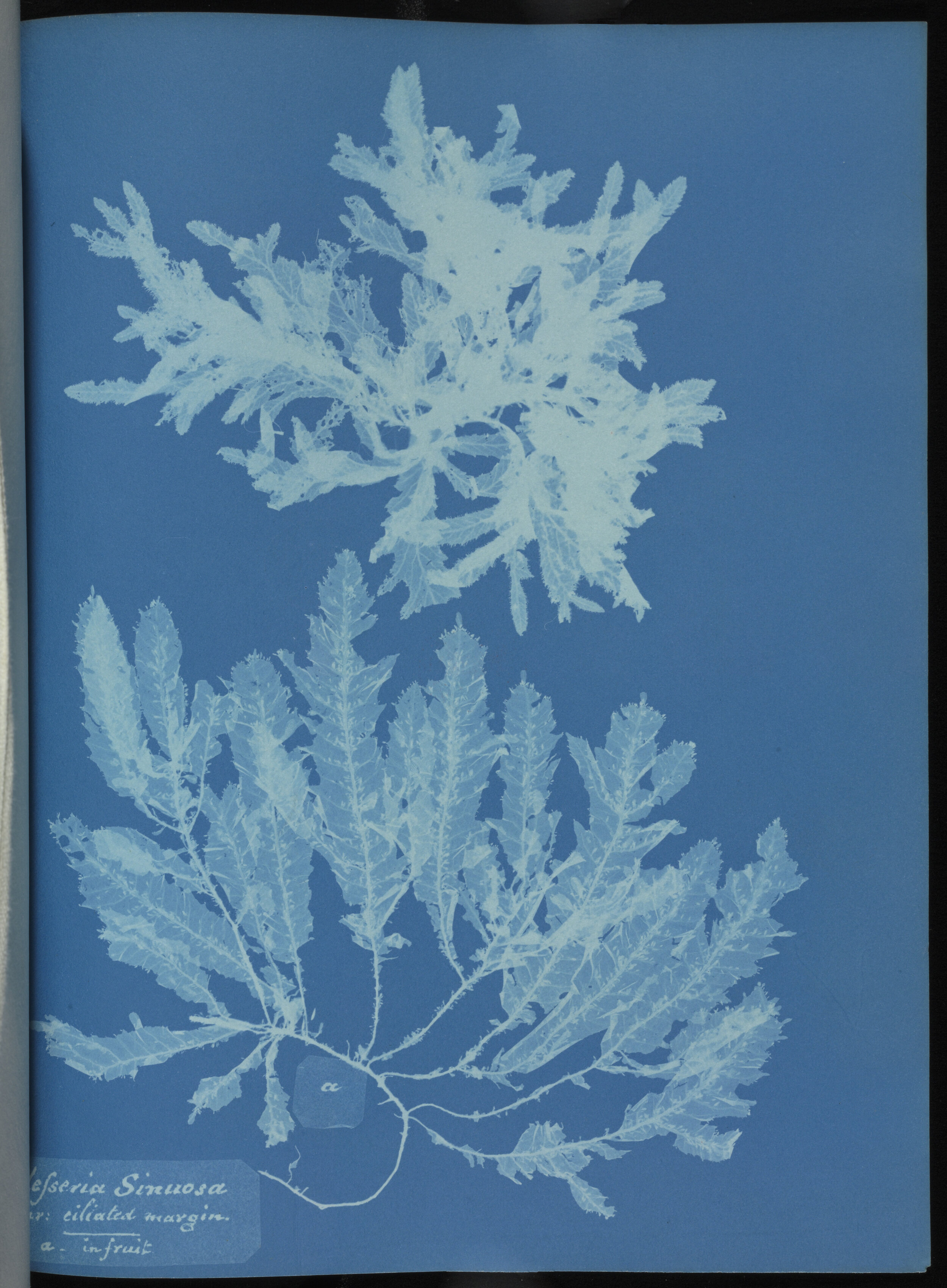
For Ernest, the cyanotype is the perfect embodiment of art and science: a moment frozen in light and shadow, conjured by chemicals in that beautiful cyan blue. While it was Sir John Herschel who developed the cyanotype method, an acquaintance of his, Anna Atkins, put the technique to innovative use – to create blueprints of her vast collection of botanical specimens. This she collated in her 1843 book, Photographs of British Algae: Cyanotype Impressions, the first book to be illustrated with photographs.

Anna was already an accomplished illustrator – a hobby considered suitably genteel for women of that period – but being the daughter of a respected scientist at the British Museum opened doors to her that would otherwise have remained shut, allowing her to mix in scientific circles and advance her study of British plants. Even by today’s standards her cyanotype impressions – the labels handwritten by Anna – are so detailed and intricate, you can distinguish one species from the next.

Chondrus crispus (c) Trustees of the Natural History Museum.jpg
Delesseria sinuosa (c) Trustees of the Natural History Museum.jpg
Gelidium rostratum (c) Trustees of the Natural History Museum.jpg
Plocamium coccineum (c) Trustees of the Natural History Museum.jpg

Anna Atkins’ cyanotypes are part of the Natural History Museum’s collection; nhm.ac.uk

Roaming close to home

In November 2020, artist and photographer Joseph Wright embarked on a project exploring the 165 public footpaths of his local parish on his daily lockdown walk. As part of our ‘On Familiar Ground’ series on Instagram, Joseph shares some of his spellbinding images with us…

All images by Joseph Wright

All images by Joseph Wright

The majority of the ideas for my work come from walking, alone. More often than not, these journeys begin at my own doorstep. Within 10 minutes I can be in the open countryside, within thirty minutes I can be out of sight of my village and already disconnecting mentally from the humdrum of life. There's something about the rhythm and pace of a good walk that puts you into a different mindset; more receptive to the world around you. Everything just seems to make sense when you’re walking.

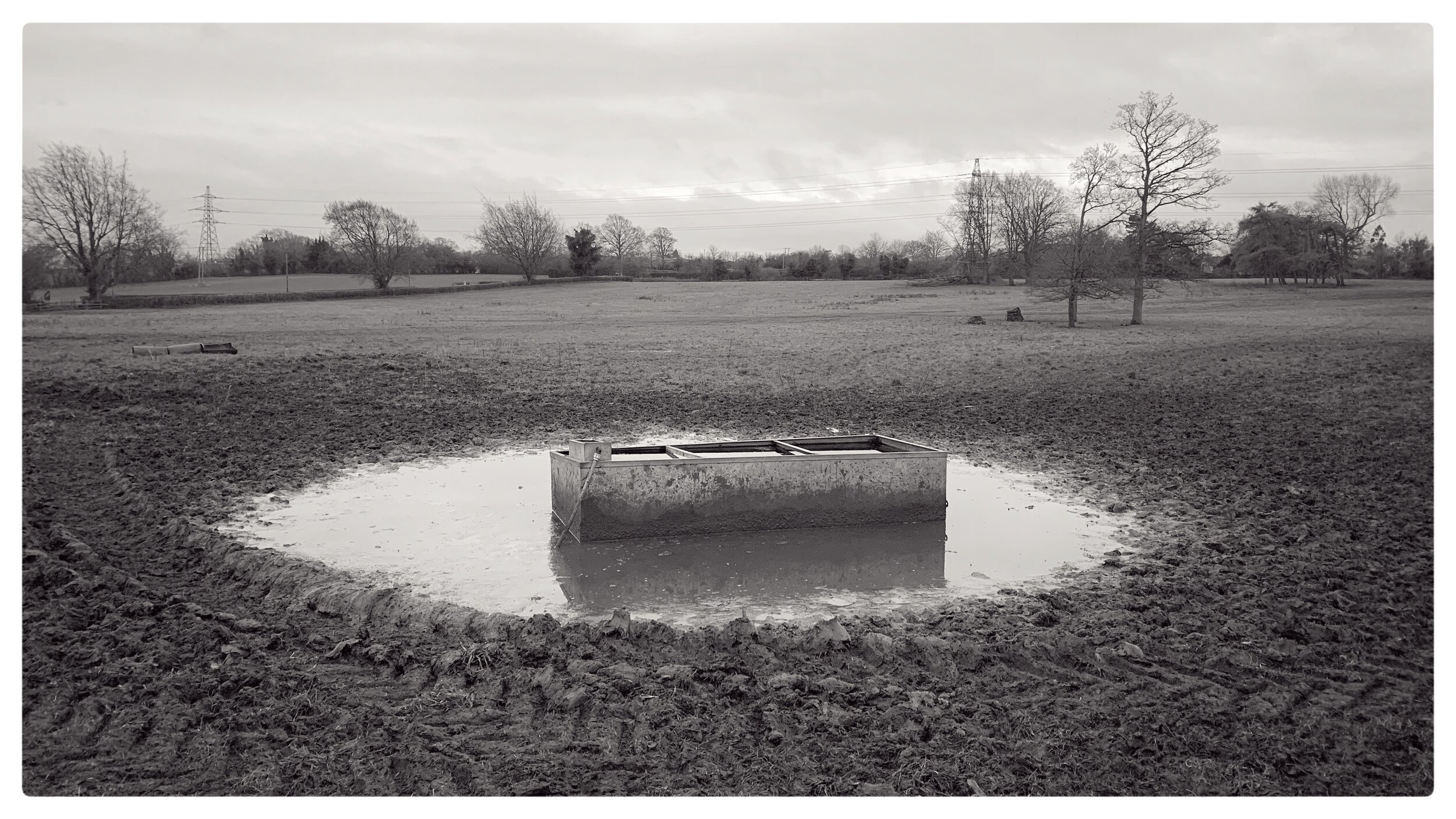
There are 165 footpaths in our village parish and while I've walked them all over the years, indeed many of them multiple times, I had yet to really incorporate them into my photographic work. So, while we've been encouraged to stay local, close to home, I set forth to walk them all once more before the end of 2020 and attempt to encapsulate a single image, which for me typified seeing and experiencing each path.

WrightJoseph-RoamingCloseToHome-#006.jpg
WrightJoseph-RoamingCloseToHome-#028a.jpg
WrightJoseph-RoamingCloseToHome-#030.jpg
WrightJoseph-RoamingCloseToHome-#035.jpg
WrightJoseph-RoamingCloseToHome-#066.jpg
WrightJoseph-RoamingCloseToHome-#090.jpg
WrightJoseph-RoamingCloseToHome-#096.jpg
WrightJoseph-RoamingCloseToHome-#104.jpg

You can see more of Joseph Wright’s work at josephwright.co.uk and more of our On Familiar Ground series on Instagram.

Meet the maker: Adam Howling

For our latest issue, Kate Tighe spoke to leading gastrophysicist Professor Charles Spence about the quirks of this new field of food-related psychological interest. On reading this interview, we had only one artist in mind to illustrate the feature…

Illustrated by Adam Howling for issue 10 of Ernest Journal

Illustrated by Adam Howling for issue 10 of Ernest Journal

Adam, you created this wonderful illustration for our gastrophysics feature in issue 10. Take us through your process.

The concept was to create a science lab crossed with an American diner, which I thought would be fun to illustrate with a retro vibe. After looking at reference materials of vintage illustrations of diners and science experiments, I started sketching out the scene to include references to the quirky food-related experiments discussed in the article. Then came a more detailed refining of the characters (something I find the most enjoyable part of the process) - this is when the illustration starts to come to life.

I draw digitally and attempt to strip the image down to essentials, using bold shapes with a limited colour palette. I then digitally add scanned textures to the illustration to give more of a ‘printers ink’ feel. I also like to give my images a screen printed feel, where each colour is printed separately, which can create interesting effects where two colours may bleed into each other from mis-registration of the the different printing plates.

How would you describe yourself as an artist?

As a commercial artist, I would describe myself as a problem solver. I enjoy the challenge that comes with distilling a concept or piece of copy into an engaging image. In my newspaper and magazine work, the communication aspect of illustration is very important to me, either by using visual metaphors or introducing a sense of humour, to add light to the accompanying text.

Are there any other exciting projects you're working on?

Soon I'll be hopefully working on a non-fiction children’s book on the subject of electricity, which is quite exciting! In the meantime I'm doing some work for various magazines - recently I had the pleasure to work on illustrations for The Radio Times, which has long been on my ‘illustration bucket list’.

Where do you turn for inspiration?

I am very much inspired by graphic design and printing techniques on ephemera from the mid-century modern period. I love simple and effective designs combined with inventive use of a limited, relatively crude printing technology. Polish match box labels from the 1950s/60s are an excellent example of this – they feature bold and concise illustrations on a range of subjects, from environmental health warnings to tourism adverts, all in the confines of a 4.5 x 3.5 cm rectangle.

By Adam Howling

What have you taken away from this past year?

As a veteran home worker, I initially believed lockdown wouldn't have a great effect on me. However, as the months of the pandemic have rolled on, I've noticed just how much of the outside world and human interactions I'd taken for granted, and that 24-hour rolling news can have a negative impact on one's mental health. I also feel very fortunate to still be working on illustrations, when many creative industries have been forced to close.

Adam’s shelf of inspiration

Adam’s shelf of inspiration

Tell us about your work space – how does it reflect you?

My studio is the rather cluttered spare room in my house. The main tool in the studio is my computer, although the paints and inks do make an appearance when creating textures for an illustration. Like many illustrators, I feel the need to collect things and surround my self with interesting objects and images. Above my computer screen I have a little 'shelf of inspiration' (above), which currently features chocolate packaging and toys from the 1950s, along with record covers illustrated by Jim Flora and David Stone Martin.

What's on your bedside table?
A vintage Huangslite Toucan lamp (in green and yellow). A rather unhealthy looking succulent. What The Hell Are You Doing: The Essential David Shrigley (2012).

Find more about Adam’s work at adamhowling.com. You can read Kate Tighe’s interview with Professor Charles Spence in the latest edition of Ernest, on sale now.

Issue 10
Sale Price:£5.00 Original Price:£10.00
Quantity:
Add To Cart

How to lay and track a scout trail

Oh, for the halcyon days of scout camp. Living unwashed in a field for a week, playing with knives and fire, trading contraband, subsisting on fry-ups and E-numbers. Veterans of this wholesome experience will probably also have enjoyed the classic scouting game of tracking a trail, where you try to find your way to a secret location by following improvised symbols made from natural materials like twigs and stones.

Screen Shot 2020-12-30 at 2.21.11 PM.png

Directions
Arrows constructed out of sticks are the most helpful way to give directions, but less fun for this same reason. Subtler tactics include tying a tuft of grass to point the right way, or placing one rock on top of another then using a third rock to indicate direction. This latter arrangement is particularly difficult to distinguish from any old pile of stones, and has been responsible for many a wild goose chase.

Screen Shot 2020-12-30 at 2.21.25 PM.png

Help and hazards
Show-offs have a wider range of symbols at their disposal, including zig- zags to indicate water, or parallel lines for an obstacle. A generous scout might leave a cache or message for friends on their trail, marked by a square with an arrow coming off it. Sticks or stones placed inside the square indicate the number of paces to the drop – possibly a melted Mars bar or a dog-eared Point Horror sealed up in a sandwich bag.

Screen Shot 2020-12-30 at 2.21.33 PM.png

Gone home
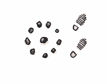
A dot in a circle means that the scout has finished laying his trail and ‘gone home’, perhaps pausing to enjoy a crafty cig while his companions are hopelessly lost in the woods. This symbol has an extra poignancy for scouters, since it’s also a euphemism for death. To this day, if you get an email about an old scout leader with ‘gone home’ in the subject line, it means their trail is at an end.

Words and illustrations by Joly Braime