Aidan, when we first approached you to illustrate Carol Devine's map of Antarctic women, what was your initial reaction?
I eagerly await all of my Ernest briefs and this one from Carol was particularly exciting! I loved having the opportunity to involve myself in all her incredible research. Maps are often snapshots of history; changing landscapes, politics and territories – this map not only shows history but amends it. It was a joy to map the success of these inspirational women explorers, scientists and innovators.
What are your feelings towards this remote, frozen continent at the bottom of the world?
It sounds like something out of science fiction – a continent made of 99% ice, with temperatures reaching −89.2 °C! I've always been a keen environmentalist and I think it's of paramount importance that we look after our frozen friend down south. Global warming and the world's biggest lump of ice... what could possibly go wrong? I've always been interested in the people brave enough to explore this hostile part of the world. But it wasn't until creating this map that I realised so many of them were women. We've been seeing Antarctica through male-tinted glasses for many years – so many maps of the past have neglected to mention the inspirational women explorers, scientists and innovators who journeyed there.
Tell us about your design process when it comes to illustrating a map.
With all maps I start by thinking of the most effective way to display the key content. From there I think about its message and how it should look and feel. Then I begin to harmonise the content with the design – it begins to get really satisfying, polishing it up until it becomes something special. In this case I thought it was important for Carol's research to do the talking. I wanted to draw influence from classic maps of the continent, while shifting the perspective to highlight those underrepresented in the past.
You also illustrated a few other maps and images for issue 7 – tell us a bit about them.
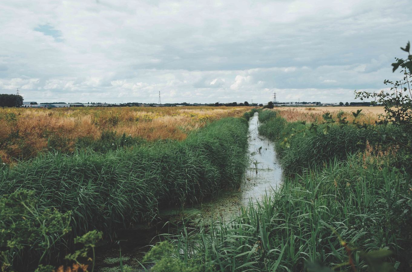
I LOVED illustrating for issue 7 – I could really get my teeth into it. One of my favourites was the little map of Doggerland for the East Anglia special - it's such a fascinating place and I was pleased with its aesthetic. It's really nice to get into multiple illustrations on a theme, such as East Anglia, partly because you can get into a groove from a design perspective, but also I love learning about new places. My head is full of hundreds of bizarre facts and stories, including the Orford Merman!
What's your favourite map (not one of yours!) and why?
Hmm, that is tough! There are so many to choose from and in so many styles. Maps I love range from Ptolemy's world map, to modern maps such as Grayson Perry's A Map of Days and the extremely practical and classic design of the OS maps. Right this very minute though I'd probably go for Walter Goodacre's Map of the Moon (below), a hand drawn map of the moon's surface, drawn in 25 segments, with the total diameter measuring 77" (1910).


